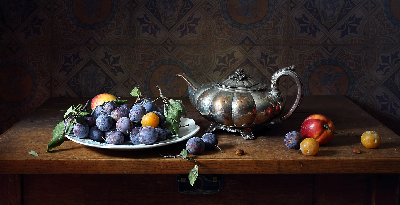
Dear Elena, I couldn't resist reading your new piece. I'd like to offer my take on it. Again, this is purely my perspective and in no way a criticism. As I wrote in my previous comment, the texture and color of the table, as well as the wall, are appealing. However, there's a slight problem with the lighting in this piece. The light is too bright for these objects. Most likely, it's direct. It's not the point. The point is that there are unwanted glare and overexposure on the teapot, especially in the very center, and on the large plum on the tray. Furthermore, the decorative pattern on the upper left side of the teapot lid blends in with the color of the wall. Perhaps I should have moved the teapot just a bit to the right? The rightmost yellow plum should have been moved to the far corner, beyond the line of the teapot, thereby drawing the eye from the objects on the table to the ornament on the wall. The large plum on the right fits beautifully into the upper curve of the teapot handle. Perhaps, to further associate the shapes, you could turn it (the plum) upside down? As if echoing the curl on the top of the teapot handle. Next comes the table handle, an interesting detail in itself, but you've covered it with a green leaf. The plate with the blue plums has two bright spots. The large plum has more yellow. I think one yellow plum in the foreground is quite enough, but I'd suggest showing more red in the large one, but in a smaller volume. That is, a kind of red barrel peeking out from behind the blue plums. The twig on the plate is very well placed, echoing the curve of the tea spout. Something like that. IMHO. I hope you won't be offended.
Dear Elena. I couldn't pass by your new work. I'd like to offer my take on it. Again, this is just my take, and in no way a criticism. As I wrote in the previous comment, the texture and colors of the table, as well as the walls, are interesting. However, there was a slight problem with the lighting in this work. The light for these objects is too bright. Most likely direct. It's not the point. The point is that there are unnecessary glare and overexposure on the teapot, especially in the very center, and on the large plum on the tray. Furthermore, the decorative pattern on the upper left side of the teapot lid blends in with the color of the wall. Perhaps the teapot should have been moved just a bit to the right? The rightmost yellow plum should have been moved to the far corner, beyond the line of the teapot, thereby forcing the eye to move from the objects on the table to the ornament on the wall. The large plum on the right fits beautifully into the upper curve of the teapot handle. Maybe, to create a greater association of shapes, you could turn the plum's tail upwards? As if repeating the curl on the upper part of the teapot handle. Next is the table handle, an interesting detail in itself, but you covered it with a green leaf. There are two bright spots on the plate with blue plums. Moreover, the large plum shows more yellow. It seems to me that one yellow plum in the foreground is quite enough, but I would suggest showing more red in the large one, but in a smaller volume. That is, a kind of red barrel peeking out from behind the blue plums. The twig on the plate is very well placed, repeating the curve of the tea spout. Something like that. IMHO. I hope you won't be offended.
Vadim, everyone has the right to an opinion. Thank you for yours. I don't think my photos are perfect, but I only accept advice from those who shoot still lifes themselves and know this "kitchen" I know this firsthand. I hope you're not offended.

Natalia Zlobina,